
More Than Pretty Pictures: Why Design is a Language Every Marketer Should Speak
Yes, design is about making things look nice – but it’s about making them work. And the best way to get results? Speaking the same language as your designer. Whether you’re reviewing a website, social post or ad, these 12 essential design principles will help you communicate your vision clearly and avoid endless revisions.
As a designer, I’ve heard it all. “Make it pop.” “Add some pizzazz.” Or my personal favorite, “Just make it look better.” And hey, I get it. You know what you want your design to do, but translating that into designer-speak so I know how to make that happen? That’s where things get tricky.
Here’s the secret: Good design isn’t just about making things pretty – it’s about communication. And just like building a website or writing ad copy, design follows a set of principles. The more you understand these, the easier it is to express your vision, collaborate effectively and get a final design that actually works.
So whether you’re a marketer briefing a designer or a business owner reviewing your new logo, knowing these 12 fundamental design principles will help us get on the same page… and avoid endless revision cycle hell.
Let’s jump into it!
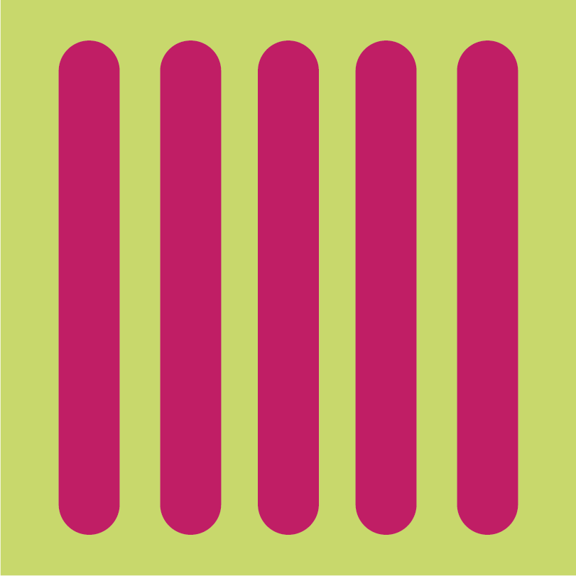
1. Balance – Creating Stability in Design


Hover to see balance in action.
Picture a seesaw with a five-year-old on one side and a sumo wrestler on the other. That’s what an unbalanced design feels like – visually lopsided, uncomfortable and unstable.
Balance ensures that no single part of a design overpowers another, creating a sense of visual harmony and ease for the viewer. There are two main types of balance:
- Symmetrical balance: A mirror effect where elements are evenly distributed, creating a sense of order and tradition. Think of a perfectly centered wedding invitation or a formal logo.
- Asymmetrical balance: Different-sized elements create movement while still feeling intentional. A bold image on one side of a webpage balanced by text on the other is a great example.
Tips for Talking to Your Designer
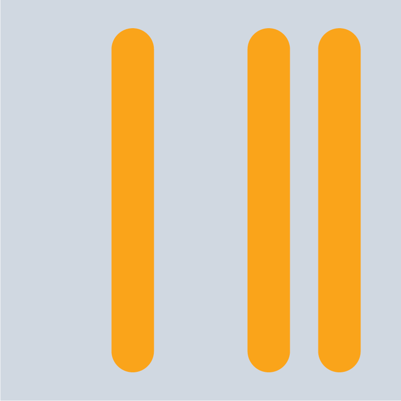
2. Emphasis – Making Key Messages Stand Out


Hover to see emphasis in action.
Not everything in a design should scream for attention. Emphasis ensures that the most important elements stand out first, guiding the viewer’s focus.
Designers create emphasis by using:
- Size: A movie poster title is always the biggest text for a reason.
- Color: A bright red “Buy Now” button won’t be overlooked like a gray one.
- Typography: Bold fonts make headlines pop, while subheadings help break up information.
- Placement: A call-to-action button should sit where the eye naturally lands, like above the fold on a webpage.
Tips for Talking to Your Designer
3. Contrast – Directing Attention and Improving Accessibility


Hover to see contrast in action.
Imagine trying to read light gray text on a slightly darker gray background. Frustrating, right? Contrast ensures that elements stand out from one another, making designs clearer, more engaging and more accessible for users with visual impairments.
Good contrast does two things:
- Creates visual hierarchy; bold headlines against lighter body text draw attention first.
- Improves accessibility; high contrast makes content readable for people with color blindness or low vision.
Tips for Talking to Your Designer
4. Harmony – Bringing It All Together


Hover to see harmony in action.
Have you ever seen an ad that felt over-designed? Maybe the colors clash, the fonts don’t match or the layout seems random. That’s a lack of harmony, or unity – the principle that ensures every element feels like it belongs.
How designers create harmony:
- Consistent Color Palettes: Think Starbucks – always green, black and white.
- Matching Typography: Two or three complementary fonts keep things professional.
- Cohesive Imagery: A mix of vintage illustrations and ultra-modern graphics? Probably not a great match.
Tips for Talking to Your Designer
5. Proportion – Keeping Elements in the Right Scale


Hover to see proportion in action.
Good design is like a beautifully plated dish – everything is in the right place, at the right size and nothing overwhelms the plate. Now, picture being served a tiny piece of steak drowning in a sea of mashed potatoes. That’s what disproportion in design looks like (and what personally keeps me up at night).
Proportion helps by:
- Prioritizing the most important elements (big, bold headlines, just like the main course).
- Balancing visuals and text so neither overpowers the other (like sides complementing the meal).
- Creating an appealing layout that feels intentional, not overwhelming.
Tips for Talking to Your Designer
6. Repetition – Using Patterns to Improve Recall


Hover to see repetition in action.
Say it with me: Repetition reinforces branding and makes designs more memorable. One more time with feeling: Repetition reinforces branding and makes designs more memorable. Imagine if Nike changed their logo font every few months. They just don’t do it because it wouldn’t feel like Nike anymore.
Repetition appears in:
- Typography: Sticking with one or two fonts across all materials.
- Color Schemes: McDonald’s is always red and yellow, not blue and purple.
- Layouts and Grids: A website with a consistent template feels polished.
Tips for Talking to Your Designer
7. Movement – Guiding the Viewer’s Eye


Hover to see movement in action.
Ever noticed how some designs just feel right? Your eyes instinctively move from the headline to the supporting text to the call-to-action button without you even realizing it. That’s movement at work.
Effective movement helps:
- Lead the Eye In a Specific Direction: A well-designed webpage naturally pulls attention to the most important elements.
- Create a Sense of Flow: A layout that lacks movement feels disconnected and difficult to navigate.
- Mimic Real-World Motion: Diagonal lines, curved paths and strategic layering can suggest movement, making a design more dynamic.
Tips for Talking to Your Designer
8. White Space – Giving Viewers Room to Breathe


Hover to see white space in action.
If design had a secret weapon, white space (also called negative space) would be it. It’s the empty space around and between elements, and while it might seem like “nothing,” it plays a huge role in making designs feel clean, balanced and professional.
White space isn’t wasted space – it’s an intentional design choice that:
- Improves readability; nobody likes reading a giant wall of text.
- Draws attention to key elements; a bold CTA button stands out more when it’s not crammed between images and text.
- Creates a premium feel; think of an Apple ad. Spacious. Minimalist. High-end. Clean.
Tips for Talking to Your Designer
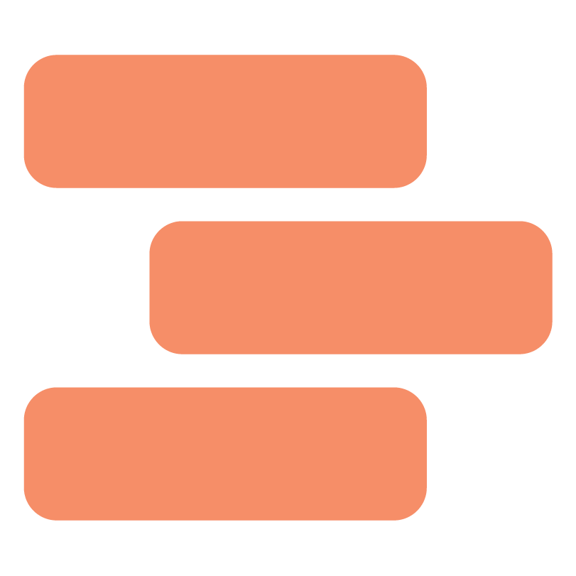
9. Alignment – Organizing Elements for Clarity


Hover to see alignment in action.
There’s a reason why great designs feel effortless: alignment. When elements line up correctly, everything looks polished, professional and easy to follow. When they don’t, a design can feel chaotic, even if you can’t quite put your finger on why.
Alignment isn’t just about making things look neat; it’s about creating visual connections between elements. A well-aligned design:
- Guides the eye smoothly from one section to the next.
- Creates consistency across multiple pieces of content.
- Improves readability, ensuring text and visuals don’t feel scattered.
Designers rely on grids, margins and spacing rules to keep everything in sync. Without alignment, a design can feel like a badly stacked Jenga tower – one wrong move and the whole thing could collapse.
Tips for Talking to Your Designer
10. Variety – Keeping Designs Visually Engaging


Hover to see variety in action.
Imagine watching a movie where every scene looks exactly the same or reading a book where all the pages follow the same layout. Boring, right? Variety keeps designs engaging without making them chaotic.
How designers create variety:
- Mixing Font Weights: Headlines, subheadings and body text should feel distinct.
- Switching Up Layouts: A social media feed with a mix of images, quotes and infographics is more dynamic than one with identical posts.
- Playing With Color and Texture: Too much of the same color or pattern feels monotonous, but strategic variation keeps things fresh.
The key? Balance. Too much variety = chaos. Too little = dull.
Tips for Talking to Your Designer
11. Proximity – Grouping Related Information Together
Hover to see proximity in action.
When elements belong together, they should look like they belong together. Proximity helps organize content so that viewers can quickly understand relationships between text, images and other design elements.
Good proximity:
- Reduces visual clutter by grouping related items.
- Improves readability so users don’t have to search for connections.
- Creates a logical flow, guiding the viewer from one section to the next.
Think of a product description next to its price or a caption placed directly under a photo. When those elements are too far apart, they feel disconnected. The closer they are, the easier it is for people to process information. If your audience has to work to figure out what goes with what, the design isn’t doing its job.
Tips for Talking to Your Designer
12. Hierarchy – Prioritizing Information for Readability
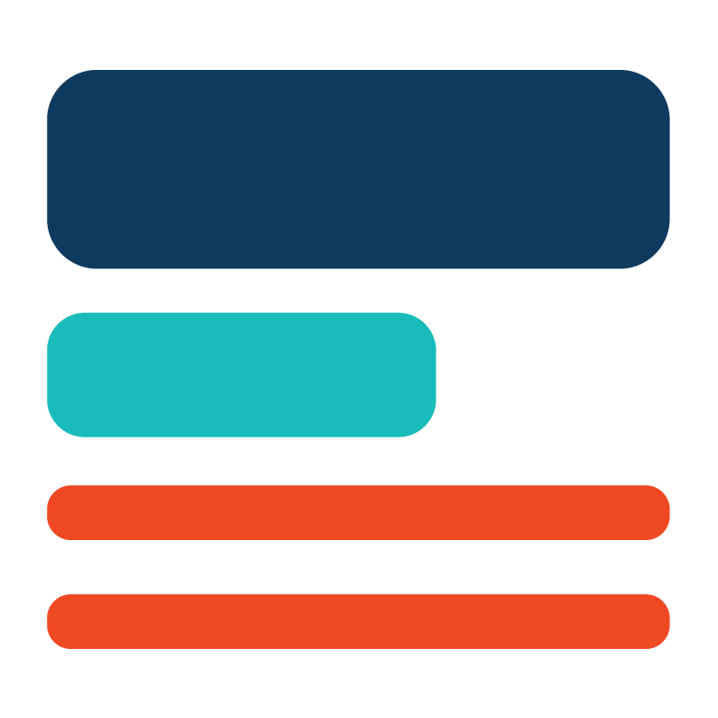
Hover to see hierarchy in action.
Ever skimmed a webpage or flyer and immediately knew what was most important? That’s hierarchy in action. It’s about arranging elements so people absorb information in the right order.
How hierarchy works:
- Larger and bolder elements stand out first; headlines should always be the most prominent.
- Color and contrast emphasize key points; a brightly colored CTA button draws attention instantly.
- Spacing and placement direct attention; the most critical info should be at the top or in a highly visible spot.
Without hierarchy, everything competes for attention. With it, the message is clear.
Tips for Talking to Your Designer
Now That’s What I’m Talkin’ About
Results matter. Design isn’t just about making things look nice – it’s about making them work. A well-designed piece grabs attention, communicates clearly and moves your audience to take action. The more you understand these principles, the easier it is to give clear, constructive feedback, and get visuals that actually serve your brand’s goals.
So next time you’re reviewing a design, ditch the “It needs more oomph” and try using one of these principles instead. Trust me – your audience (and your designer) will thank you.
Need help bringing your vision to life? That’s where Responsory comes in. Whether you’re rebranding, launching a campaign or fine-tuning your marketing materials, our team of expert designers and strategists can turn your ideas into powerful, results-driven visuals. Let’s create something great together – reach out to Responsory today!

About the Author
Nicholas Mork is the kind of Creative Director who turns sparks into wildfires. Effortlessly navigating every twist and turn of the creative trail, he forges work that’s both strategically sound and visually unforgettable. Known for weaving humor and a whole lot of metaphors into the serious business of design, Nicholas can make even Comic Sans shine. Off the clock, you’ll find him growing a beard like a lumberjack, sipping Laphroaig like a connoisseur and cheering for the Minnesota Wild with the heart of a true fan. Skøl!