You may have a very attractive landing page, but is it a high-converting landing page? We love to design great looking work but here at Responsory, we focus on smart, fact-based design. That means we’re designing for results and snazzy photos or wacky art don’t always lead to better performance.
A landing page is a specific page that has been expressly designed to achieve a particular goal. Typically, the goal will be to obtain the user’s contact information. But it could also be to download a PDF, register for a webinar or make a purchase. Whatever the goal is, the landing page should be solely focused on that goal.
 In 3 Strategies for Winning More Landing Page Conversions, we cover the anatomy of a basic landing page, but great landing pages will have a few more elements in order to maximize conversion rates. It’s important to note here that the perfect landing page doesn’t exist. Landing pages can always be improved and there’s no reason not to continuously work at making them better.
While all of the following elements can help to increase conversion rates, sticking all of them on a page without any thought is a sure-fire way to fail. A successful landing page is greater than the sum of its parts.


Here are 7 highly influential elements of a high-converting landing page:
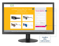
- A captivating headline – This is the first and possibly the only thing visitors will read. The headline is where you win or lose them. The key here is to explain the benefit you are offering to users in a single sentence. Don’t talk about features, talk about what they can achieve thanks to your offering. Make it all about the user. You should spend as much time on this single element as you do creating the rest of the landing page. Why? Because research has shown that over 90% of users who read your headline will also read your CTA.
- A stellar offer – You could have the best landing page in the world, but if your offer stinks, users aren’t going to be converted. If your goal is to get new subscribers to your blog, you’ll probably want to give away something for free like an in-depth guide to your chosen topic. If you want people to sign up to your webinar, you’ll need to highlight why your webinar is so good. What is the user going to learn from you and how will it benefit them? This will be the second thing users will read, so make sure the copy for your offer follows on nicely from your title.
- Eye-catching images – Some users won’t bother to read your headline. But if they see an image that they relate to, they may be persuaded to give the landing page a second chance. Don’t just use any old stock image, however. Think of your image as a second headline. Make it powerful; make sure it shows off your product or offering and the benefit to the user if possible.
- A sweet video – Do you know what’s better than images? Video! If a picture says a thousand words, how many words does a video say? Ten thousand? A million? However many it is, videos are a great way to increase conversion rates. In fact, research from Eye View Digital has shown that using video on landing pages can increase conversions by 86%.
- Trust indicators – These can be anything from testimonials and reviews to customer logos and Industry certifications. This is an especially important element if the goal of your landing page is to persuade users to buy a product. But even if you’re just trying to get more email sign ups, it is still a good idea to put trust indicators on your landing page.
- A clear call-to-action – It’s no good having a landing page if users don’t know what to do on it. This is where your call-to-action (CTA) comes in. It should be clear, prominent and assertive. “Sign up here”, “Add to cart” and “Download now” are common calls-to-action that you will see across the web. As always though, your CTA should be tailored to your offering and your audience.
- A post-conversion page – When’s the best time to get a user to convert? When they’ve already converted. This is the goal of a post-conversion landing page. Once they’ve clicked the call-to-action and filled in their information, follow them up with another offer. Maybe this is a product upsell or a request to become a newsletter subscriber. Whatever it is, there’s no better time to strike than while the iron is hot. If you don’t have an applicable post-conversion offer, consider a thank you instead.
Need assistance? That’s ok! Responsory has strategized, written, designed, built, optimized and launched hundreds of landing pages. Consider us your go-to resource for building campaign landing pages that earn results. Ask for a free copy of our Landing Page Go-to Guide when you contact Responsory to chat with one of our digital pros about your landing page goals.