 When you begin a website design and development project, it’s very tempting to begin with design concepts. Everyone loves to be involved in the look and feel of a brand new website.
But beware…hitting fast forward to the design stage creates a lot of risk for your brand, your business and marketing plans and organization as a whole. It doesn’t take into consideration the invaluable research and strategy that’s required to create a powerful user experience and the bottom line results to which your website should be a significant contributor.
So where SHOULD you begin?
Great question! In this article, you’ll find the answer and several ways the wireframe method will help you avoid the perils of premature design.

If you are embarking on a website refresh or building a new site from scratch, wireframes are a critical tool to streamline the design and development process. Whether you’re developing the site with internal or external resources, your web team’s process should not overlook the importance of wireframing.
Definition of wireframe:
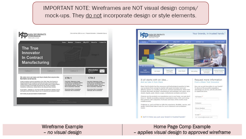
A skeletal model in which only lines and vertices are represented, displaying the functional elements of a website or page, typically used for planning a site’s structure and functionality.
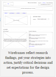
Devoid of design, color, fonts or styles, logos or images, wireframes are simple black and white layouts that outline the elements of a page, their size, where they are placed, site features, calls to action and navigation for your site.
First Things First
The wireframing initiative follows a thorough research and strategy phase that involves these activities and deliverables:
ACTIVITIES
- Stakeholder/Management Audit
- Client Knowledge Transfer
- Website Analytics Review
- Primary/Secondary Research
- Competitive Analysis
DELIVERABLES
- Scope of Work
- Technical & Design Requirements
- Tech Recommendations
- Information Architecture
- Project Timeline
The Research & Strategy phase deliverables are essential to the proactive, user-focused thought process that is a must-have for wireframe development.
Wireframing your website’s home page and primary landing pages will ensure success in many ways. Here are three:
1. Information hierarchy
Your site map will feed the development of a wireframe that visually displays how your users will navigate the site. Because the wireframe is a skeleton without “skin” or any design or color, your decision making team will have no distractions and can easily determine whether the location of content – from the logo and masthead to the footer – makes sense for your organization and more importantly, your users.
2. Content placement
The two-dimensional illustration of your site’s interface will specifically dictate the prioritization of content and where it appears on a page. In addition, the wireframe will demonstrate the proposed functionality and the behaviors you intend your users to take.
3. Calls to action
Again, that naked wireframe, sans style and distracting design, will reveal what and where your call outs for user interaction will adorn your page. You’ll quickly be able to gauge whether your CTAs (calls to action) are prominently displayed and are pointing your users in the right direction.
Case In Point
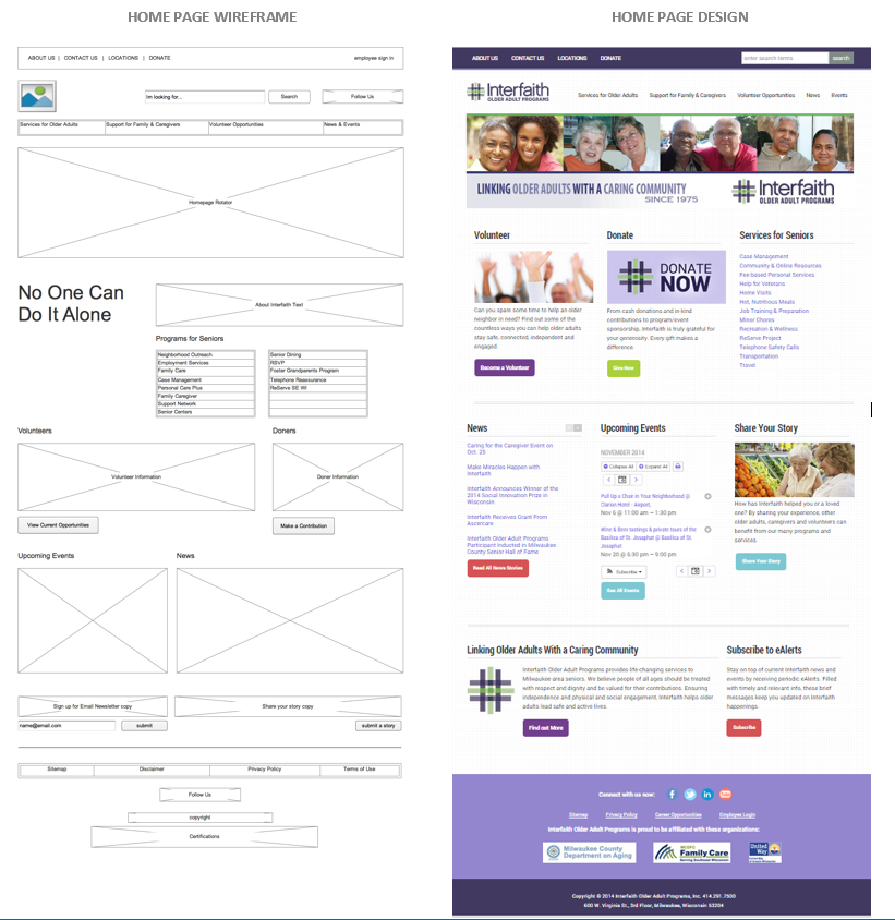
The wireframing phase helped us establish parameters and set expectations for our client, Interfaith Older Adult Programs, in renovating their online presence. Interfaith decided to redesign its website to make it easier for its target audiences to find what they need from them. Felice Green, Marketing Director, Interfaith, said, “Whether you’re an older adult looking for a little extra help, a family caregiver looking for resources, or a volunteer looking to make a difference in your community, our goal is to put all the info you need right at your fingertips.”
Here are just a few reactions from key stakeholders following the launch of the new website:
I quickly “drove” through a number of these pages and it all looks terrific! I’m VERY impressed and can certainly see how much time and energy went in to providing solid info in a great format. –Chris
Wow!!! Outstanding effort! I’m really impressed with the easy flow and navigation. Excellent job. –William
The new website is meeting Interfaith’s expectations, according to Google Analytics. Users are swiftly getting into key pages within the site from the home page and exploring integral program pages that were buried in the previous site. The wireframe helped ensure we met and exceeded this client’s expectations.


