Congrats! Your marketing piece drove a visitor to your landing page. Now what? Will she be influenced by your messaging? Will he engage with your offer? Or, is it game over with a quick exit?
To truly win, you want to convert those visits to leads and to do that, you need an ultra-effective landing page.
The first thing to understand is that your campaign landing page must be a stand-alone entity that has one, singular focus – to convert visitors to legitimate leads or customers. That means your page needs to feature a compelling reason to act – an offer.
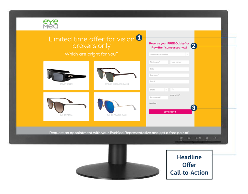
Effective landing pages are successful because they are tailored for a specific campaign. What does that mean? Let’s breakdown 3 basic elements that make a real difference:
15 Offers that Entice
- Contest or giveaway entry
- Discount or special price
- Download content (whitepaper, infographic, guide, etc.)
- Free consultation
- Free Demo
- Free Quote
- Free Gift with Meeting or Order
- Free Sample
- Free Trial
- Information kit
- Introductory offer (discount, freebie, gift)
- Satisfaction Guarantee
- Subscribe
- Upsell or cross-sell add-on or discount
- Webinar invitation

1
Headline – This is the first thing people see and will usually outline exactly what you are offering. There should be no question in the users’ minds as to what your business or page is promoting.
2
Offer – You must give users a reason to take action. This is achieved by highlighting what you are offering and how they will benefit from it. You may decide your offer is so fabulous and will be instantaneously well-received that you’d like it and your form featured right at the top of the page.
If not, you’ll want to draw your user in with a compelling hero image and headline. Movement that doesn’t impede speed is a great way to capture attention.
Consider adding a call-to-action (CTA). It can gently guide the visitor to the next step in his journey. This CTA can anchor the user directly to your response mechanism.
3
Call-to-action and response mechanism – The CTA is the element that tells your users what to do to act on your offer.
In most cases, you won’t want to bury your enticing offer and easy-to-use response mechanism. Make the offer and eligibility clear. Link to a terms and conditions page to cover your legal bases. Add an expiration date if applicable.
Most importantly, if you’re using an online form response mechanism, don’t be greedy on required fields. Include only the fields that are necessary to get your lead to the next step.
These tips will get you to the starting gate, but to win big and strive for continuous improvement, you’ll need a more comprehensive landing page game plan. Ask for a free copy of our Landing Page Go-to Guide when you contact Responsory to chat with one of our digital pros about your landing page goals.


