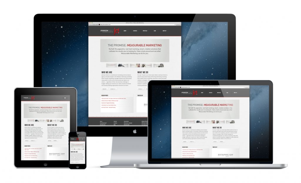
By 2014, mobile internet will likely take over desktop internet usage. Already, more than one half of all local searches are done on mobile devices. We’re spending 2.7 hours every day on our smart phones and tablets and this statistic will only grow as our devices become more and more internet-friendly.
So, what’s the problem? Businesses are struggling to publish websites that offer easy reading and navigation across the range of devices used by their audiences. These businesses are losing leads, sales, referrals and credibility for every frustrated user who abandons their unresponsive site.
If your organization’s website is not designed to be responsive to provide the optimal viewing experience across the devices your visitors are using, how can you fix this problem?
In a Q&A sit-down with Responsory’s interactive team we explore the challenges many businesses face when addressing responsive web design.
What is responsive web design (RWD) and what types of businesses or marketers need to be concerned with it?
Responsive web design produces an optimal viewing experience across a wide range of devices (from desktop computer monitors to mobile phones). A responsive website design is one that automatically fits in your visitor’s device. Whether your visitor is on a PC, laptop, tablet or mobile phone, a responsive site’s elements will rearrange automatically, delivering the best experience for the user in terms of easy reading and navigation (menus, buttons, finger space, etc.) and without a lot of resizing, panning and scrolling.
Any business with a website that plays a role in the sales or marketing of its overall brand or specific products/services MUST be aware of RWD.
What is the risk of not having a responsive web design? Is it really an issue for our website users?
The greatest risk is poor usability. Without RWD, your website visitors will not get the best viewing experience. Poor usability interferes with how your visitors interact with and navigate through your site. Poor usability = poor sales.
There are other risks. When businesses opt to have separate sites to serve multiple platforms (e.g., regular site and a mobile version), they often sacrifice content and functionality. Further, they have to maintain more than one site with updated content, enhancements and upgrades.
How do we go about converting our current website into a responsive website?
First, determine if your current site is in great condition in terms of its overall design, content, navigation and user experience. If not, these things need to be addressed before you create your responsive version.
Next, meet with (or hire) an experienced RWD developer. When designing for a variety of devices, your developer will be thinking about operating systems, screen sizes, pixel density and CSS @media queries as they relate to your current site. He or she will do the heavy-lifting in terms of decisions that need to be made to rearrange or modify elements for that optimal multi-device experience. For example, replacing your main menu’s functionality on touch devices, hiding/reordering secondary content, or triggering multimedia to only display under certain conditions. Your new site will be tested thoroughly and you’ll have the opportunity to preview it within all of the browser environments before it goes live.
And just to clarify, RWD is a move away from the “pixel-perfect design” strategy that most clients think they need. Instead of the site looking the same browser to browser, progressive enhancement will be at work. A site will not only look different across devices, but also across browsers and platforms — on purpose. “Optimized” is the key word.
How much does the design and development of a responsive website cost?
There is no cut and dry answer for this question. As you can imagine, it depends on your current site’s condition, your business and marketing goals and a plethora of other considerations. The value of a responsive design is realized when your tablet and mobile users have the same outstanding experience that your desktop and laptop users have; and respond accordingly. The cost of not pursuing RWD is the loss of engagement and sales with your growing audience of mobile users.
What we can tell you is that the full execution of RWD does not take place until your current site is performing optimally. This means the design represents your company’s brand properly, the navigation is working well for your users, and the content is optimized, well organized and highly relevant. Let’s assume enhancements to your current site are necessary. We pursue a RWD following the redesign/redevelopment and launch of your standard website, ensuring it meets your business/marketing goals and is set up properly for further responsive enhancement.
The real cost to consider here is how much revenue or engagement your organization could be losing each time a visitor to your site (remember, 9 out of 10 Americans use a mobile phone) is frustrated by its unresponsive design. Each exit from your unresponsive website could be robbing your bottom line and damaging your brand’s credibility in the marketplace.
Aright, you’ve convinced me. We need to upgrade our website to a responsive design. Now what?
Audit your current site’s user performance and pinpoint potential issues and known weaknesses. From there, you’ll have a better understanding of your users’ pain points and can devise a plan to launch a stronger web presence and one that is truly optimized for your users, no matter what device their on … desktop monitors, laptops, tablets or mobile phones.


